Buyer's Guide
How to Match Blinds to Your Decor
Choosing a blind colour is less about trends and more about one decision: blend in or stand out. Get that call right and the blinds disappear into the room (or elevate it) instead of fighting the walls, trim and furniture. Below is the practical framework our Calgary consultants walk clients through during every free in-home measure, plus the real trade-offs between light and dark fabrics that most guides skip.
Match vs. Contrast: The Two Real Strategies
Every blind colour decision comes down to one of two approaches. There's no wrong answer — it depends on whether you want the window to recede or become a feature.
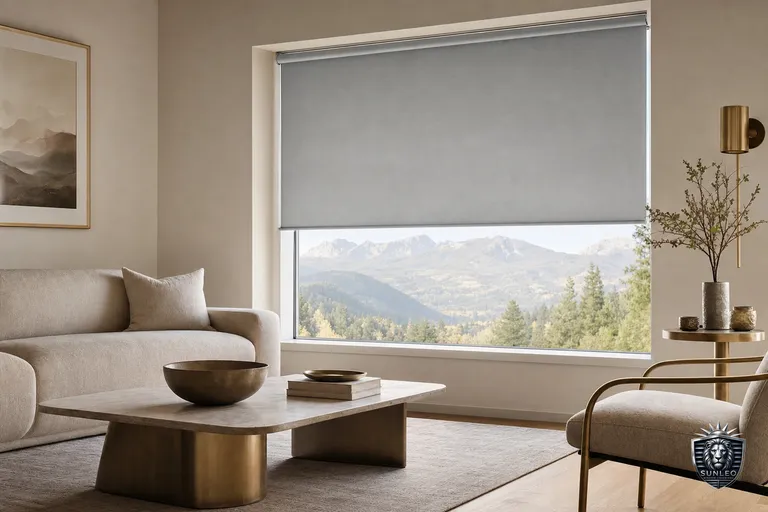
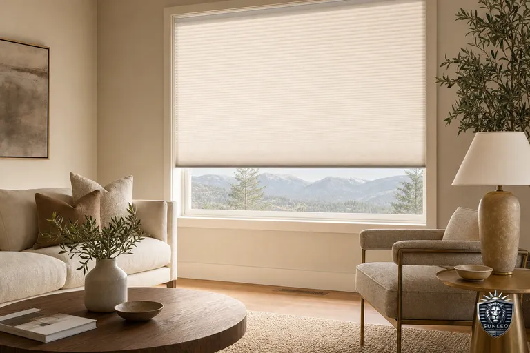
- Match strategy: choose a blind within one or two shades of your wall or trim colour (e.g., warm white blinds against warm white walls). The window frame disappears, ceilings feel taller, and the room reads calmer and larger — the safest choice for resale and for rooms with busy furniture or art.
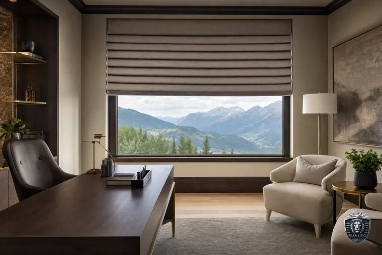
- Contrast strategy: choose a blind that echoes an accent colour already in the room (a charcoal sofa, black door hardware, walnut furniture). This turns the window into a design element and adds depth, but commits the room to that palette.
- Rule of thumb: match to trim in shared/resale-sensitive spaces (living room, entry, whole-home flow); contrast in one statement room (primary bedroom, office, dining) where you're not afraid of personality.
Matching to Walls, Trim and Furniture — In That Order
When a client can only get one relationship right, we tell them to prioritize trim first, walls second, furniture third — because trim and walls are permanent and furniture changes every few years.
- Trim/frame colour: if your window casings are white, off-white blinds virtually vanish; if trim is stained wood, a wood-tone faux wood blind reads intentional rather than mismatched.
- Wall colour: pick a blind 1-2 shades lighter or darker than the wall for subtlety, not an identical swatch match — true colour-matching under different light sources (daylight vs. evening lamps) can look slightly 'off' rather than seamless.
- Furniture and textiles: use furniture only as a secondary reference (rugs, sofas, cushions) for a contrast accent, not as your primary colour source — furniture is the easiest thing in the room to replace later.
- When in doubt, neutral wins: warm white, greige, and soft taupe blinds pair with almost any wall colour and don't date as quickly as trend colours.
Light vs. Dark Blinds: The Trade-Offs Nobody Mentions
Colour isn't just aesthetic in Calgary's climate — it changes how a room feels day to day.
- Light-coloured blinds (white, cream, light grey): reflect more heat and sunlight, keeping south- and west-facing rooms cooler in summer; show less glare when backlit; and read as neutral/resale-safe to future buyers. Downside: they show dust and fingerprints faster in high-traffic rooms like kitchens.
- Dark-coloured blinds (charcoal, navy, espresso): absorb more heat, so they can make a sun-drenched room noticeably warmer in summer — better suited to north-facing rooms, shaded windows, or bedrooms where you want a cocooned feel. They also hide daily marks well but can look chalky or faded first if the fabric isn't UV-treated.
- Glare: on very bright walls, dark blinds create high contrast against the window opening, which some clients find pleasant (a 'framed' look) and others find harsh — light blinds soften that contrast.
- Resale-neutral choice: if you plan to sell within a few years, light or mid-neutral blinds are the safer, broadly appealing option; dark blinds can look striking but are more a personal-taste commitment.
A Simple 4-Step Decision Framework
Use this order of questions to land on a colour without overthinking it.
- 1. Sun exposure: is the room south/west-facing and gets strong afternoon sun? Lean lighter to manage heat and fading. North-facing or shaded? Darker tones are fair game.
- 2. Resale horizon: selling within 3-5 years, or is this a shared/whole-home look? Match to trim with a light neutral. Staying long-term and want personality? Contrast is fine.
- 3. Room function: bedrooms and media rooms often benefit from darker or blackout-lined fabrics for light control; kitchens and living rooms usually wear light neutrals better long-term.
- 4. Existing palette: if walls, trim and furniture are already coordinated, match the dominant neutral. If the room feels flat or beige-on-beige, a contrast blind in one accent colour adds the missing depth.
See It Before You Commit
Colour under a phone screen or store lighting rarely matches how a fabric looks against your actual walls and Calgary daylight. That's why every Sunleo free in-home measure includes bringing physical swatches into the room in question, so you can hold real fabric against your trim, walls and furniture before choosing. No pressure, no online cart — just a second set of eyes and the samples in hand.