Buyer's Guide
How to Choose the Right Blind Colour for Any Room
Blind colour is the one decision that can make custom window coverings look either seamlessly designed or slightly "off." The tricky part is that colour behaves differently on a fabric sample under store lighting than it does on your actual windows at home. In Calgary, where bright prairie sun, snow glare, and long winter shadows all shift how a shade reads, the safest method is simple: pick a reference to match, choose a tone that fits your light, and then confirm with real samples in the room. This guide walks through exactly how to choose blind colour with confidence, whether you want a quiet backdrop or a statement.
Start by deciding what your blinds should match
Before you look at a single swatch, decide the job the colour has to do. Nearly every good blind-colour choice comes down to matching one of three references in the room:
- Match the trim/frame — Painting the blind colour close to your window trim (usually white or off-white) gives a clean, built-in, architectural look. This is the most forgiving, resale-safe choice and works in almost any room.
- Match the wall — Choosing a shade near your wall colour lets the window visually disappear, making walls feel larger and calmer. Great for bedrooms and small rooms where you want the window to recede.
- Match the furniture or accents — Picking up a tone from your sofa, rug, cabinetry, or a feature colour turns the blind into a deliberate design accent. This has the most personality but dates fastest, so use it where you change decor often.
Neutrals vs bold: how to decide
Most homeowners are choosing between playing it safe with a neutral and making a statement with a bolder colour. Both are valid — it depends on how long the blinds need to last and how much the room changes.
Neutrals (white, cream, greige, warm grey, soft taupe, natural linen) are the workhorses. They flatter changing furniture, brighten interiors, hide dust between cleans, and are the friendliest for resale because buyers can picture their own style. If you plan to stay a long time or want zero regret, warm neutrals are the answer.
Bold or deep colours (charcoal, navy, forest, terracotta, black-out browns) add drama, frame a view, and feel high-end in media rooms, feature windows, or modern spaces. The trade-off is that strong colours commit the room to a palette and can absorb light, so reserve them for spaces with plenty of daylight or a clear design intent.
A reliable rule: go neutral on the fabric and add your personality with the room's soft furnishings, which are cheap and easy to swap.
- Choose neutral if: you want longevity, plan to sell, have lots of windows, or an evolving decor style.
- Choose bold if: it's a feature window, a cosy or dramatic room, or you have strong committed colours already.
- Warm-toned neutrals (cream, greige, sand) suit Calgary's cooler natural light better than stark cool greys, which can read flat and blue in winter.
Understand how colour changes the light in a room
Colour does not just decorate the window — it changes the quality of light that enters. This matters a lot in Calgary, where winter days are short and every bit of daylight counts.
- Light and white fabrics reflect and diffuse daylight, keeping rooms bright, airy, and cooler in feel — ideal for north-facing rooms, offices, and small spaces.
- Dark fabrics absorb light and can make a room feel smaller and moodier, but they reduce glare beautifully on screens and TVs and give a premium, cinematic look.
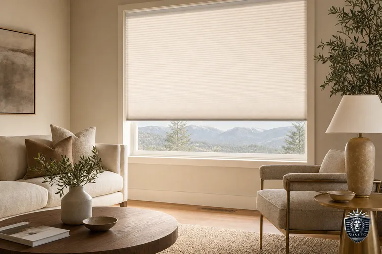
- Sheer and light-filtering fabrics glow with a soft wash of light; the fabric colour subtly tints that glow, so a warm cream sheer casts a cosy tone while a cool grey reads crisp.
- On sun-facing windows, mid-tones hide dust and sun-fade better than pure white or very dark fabrics, both of which show wear sooner.
- For blackout in bedrooms, colour barely affects darkness — the blackout backing does the work — so you're free to pick the shade you like.
Make resale-safe choices (without playing it too safe)
If there's any chance you'll sell your home, treat blinds as a semi-permanent, built-in feature — buyers rarely replace them right away. The safest approach is a neutral fabric on the window paired with your bolder choices kept to easily-changed items.
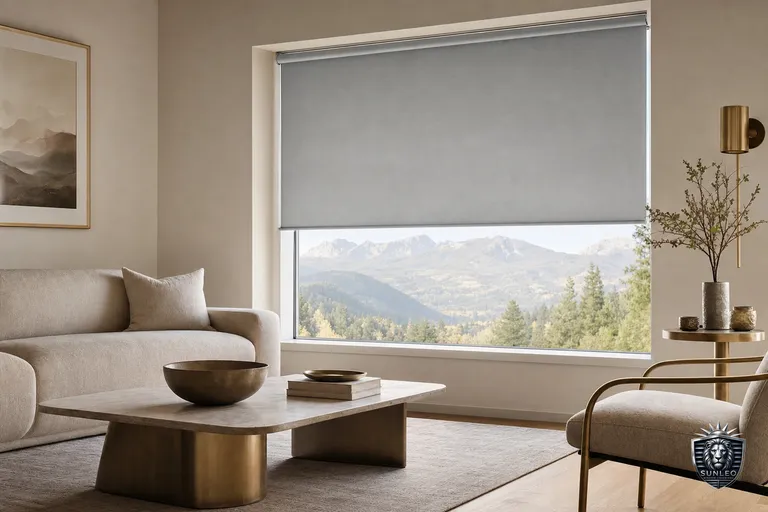
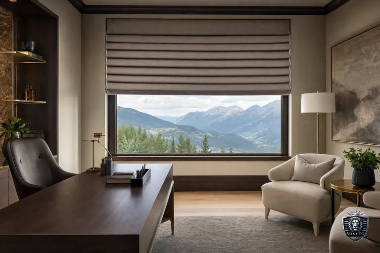
White and off-white keep trim looking crisp; warm greige and soft taupe read current and hide marks. These tones photograph well in listings and suit the broadest range of buyer tastes. If you love colour, apply it through a Roman shade fabric in a low-stakes room, or through motorized roller blinds in a neutral that still feels intentional. Avoid trend colours on every window in the house — that's the choice most likely to feel dated to a future buyer.
Let samples in your own light make the final call
This is the step that decides everything, and the one people skip. Fabric colour shifts dramatically depending on the light source: showroom LEDs, phone screens, and printed brochures all lie a little. The only reliable test is a physical sample of your actual fabric, on your actual window, seen at different times of day.
During a free in-home consultation, a Sunleo advisor brings real fabric samples so you can hold each finalist against your trim, wall, and furniture, and watch how it looks in bright morning sun, flat midday light, and evening lamplight. Colours that felt identical on a screen often separate instantly in the room — one suddenly reads too pink, another too grey. Trust the sample in the space, not the swatch on the screen.
- View each sample against the trim, then the wall, then near your main furniture piece.
- Check it in daylight and again under your evening lighting — Calgary's warm indoor lighting shifts cool greys noticeably.
- Look at the fabric both flat and held up to the window with light behind it, since backlighting changes the tone.
- Narrow to two finalists and live with the samples taped up for a day before deciding.